
Falk Culinair
Premium cookware identity rooted in craft and built to flex from product to print.
Premium cookware identity rooted in craft and built to flex from product to print.
Intro
Falk Culinair is known for meticulous copper cookware. I developed a modern identity that honors that craftsmanship while giving the brand a strong, timeless presence across every touchpoint.
Falk Culinair is known for meticulous copper cookware. I developed a modern identity that honors that craftsmanship while giving the brand a strong, timeless presence across every touchpoint.
Role
Creative Director and Designer
Scope
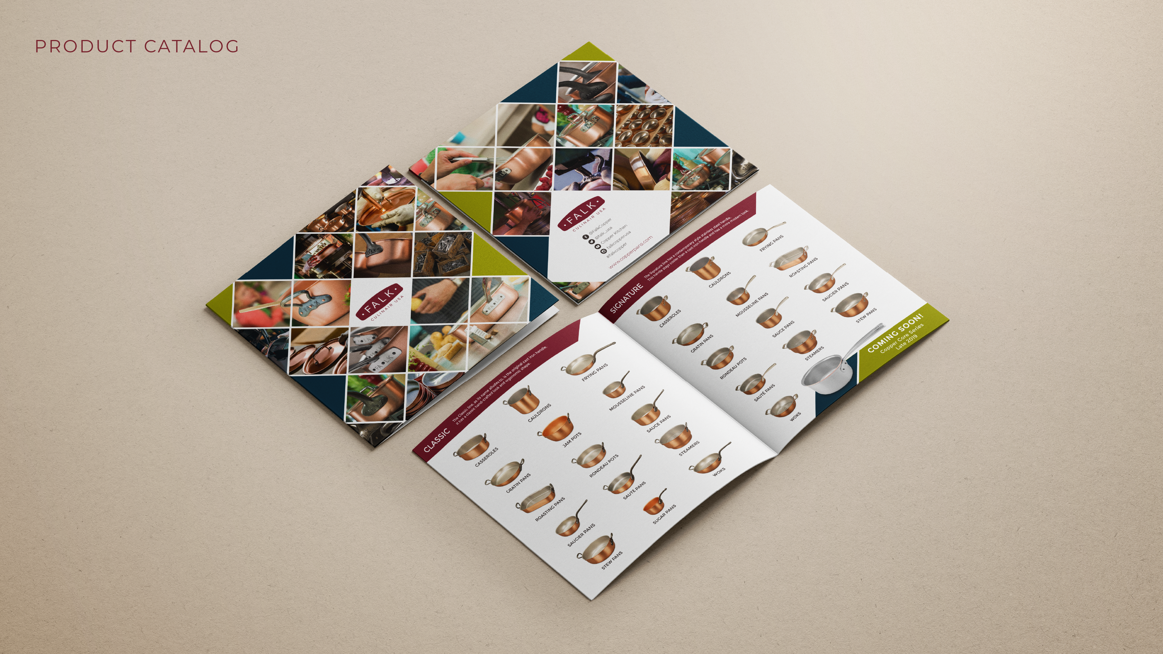
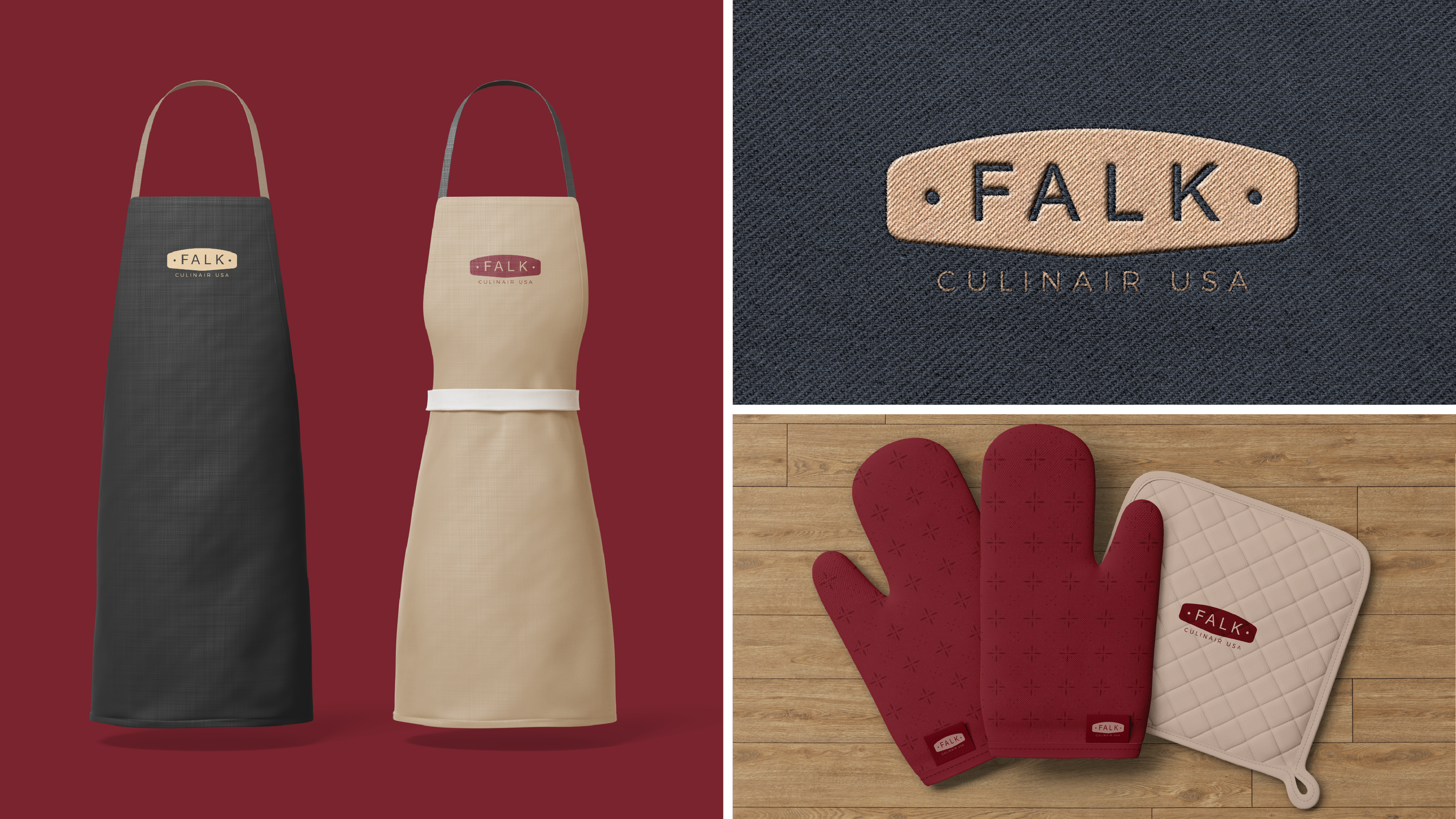
Strategic Brand Identity | Logo Suite and Badge | Color and Typography | Imagery Direction | Literature Design | Signage | Product Accessories
Creative Director and Designer
Scope
Strategic Brand Identity | Logo Suite and Badge | Color and Typography | Imagery Direction | Literature Design | Signage | Product Accessories
Outcomes
• Cohesive system across literature, signage, accessories, web, and social.
• Versatile logo family that works from product labels to digital use.
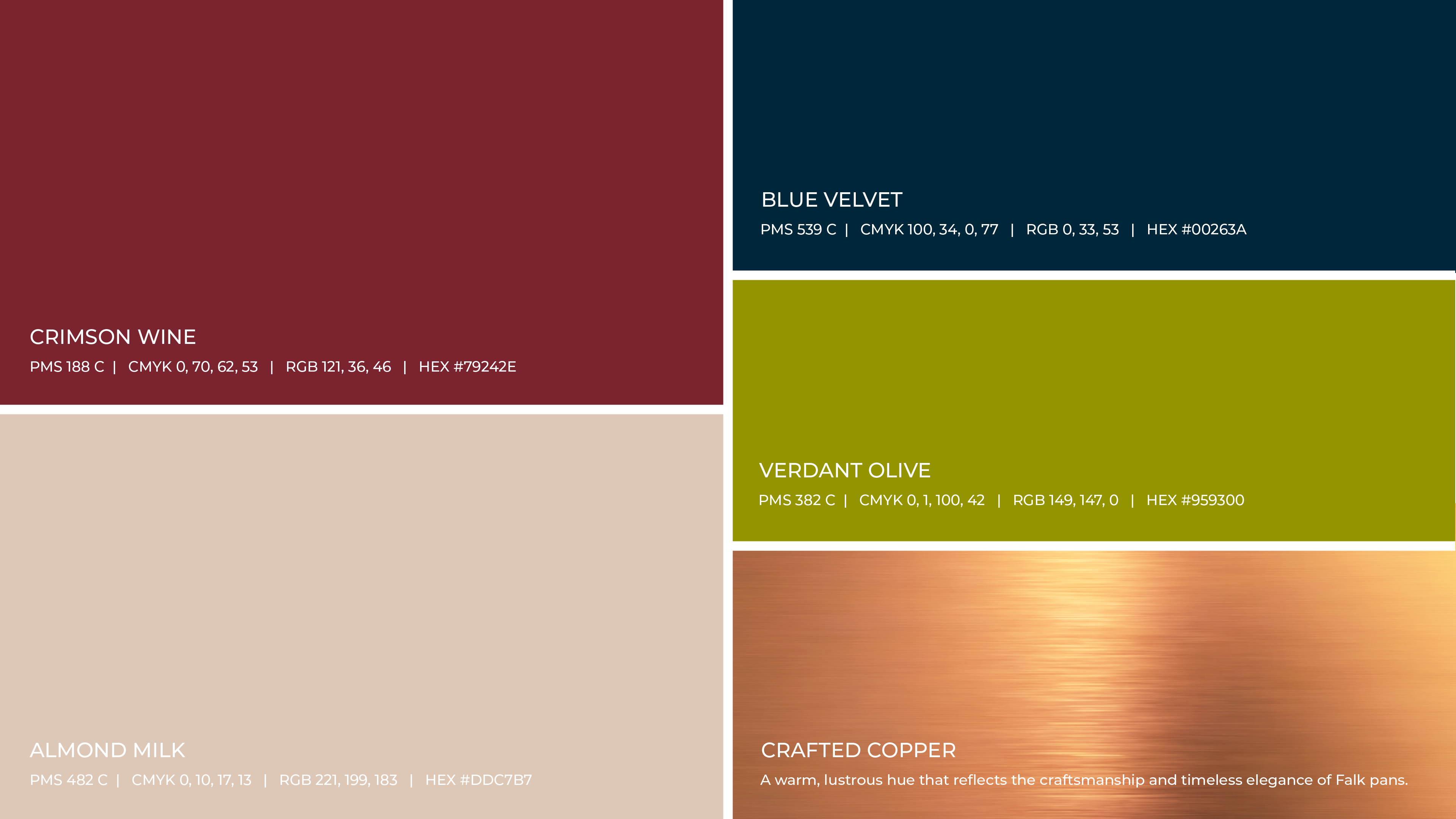
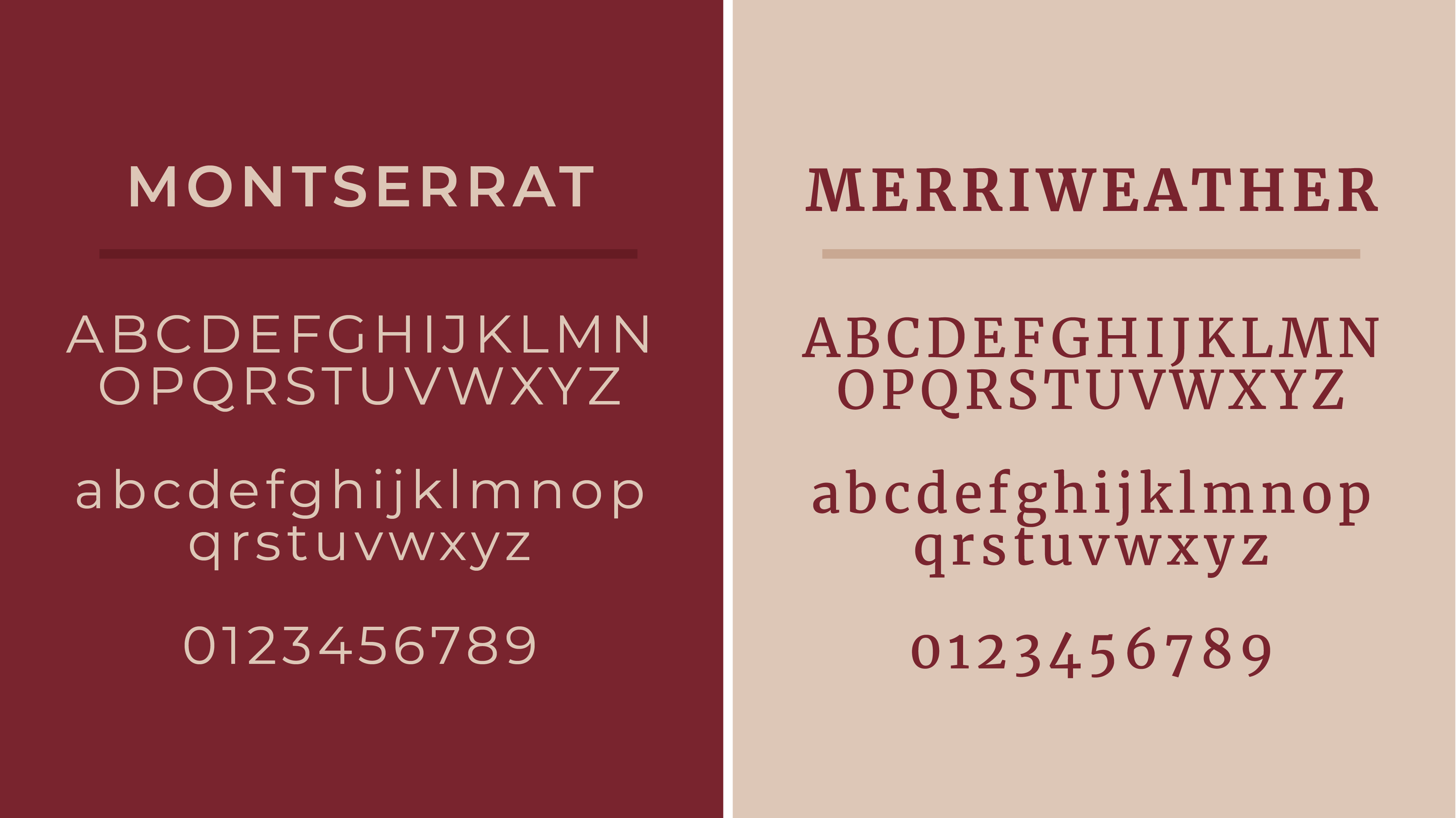
• Distinct palette and type pairing that signal quality and elegance.
• Cohesive system across literature, signage, accessories, web, and social.
• Versatile logo family that works from product labels to digital use.
• Distinct palette and type pairing that signal quality and elegance.
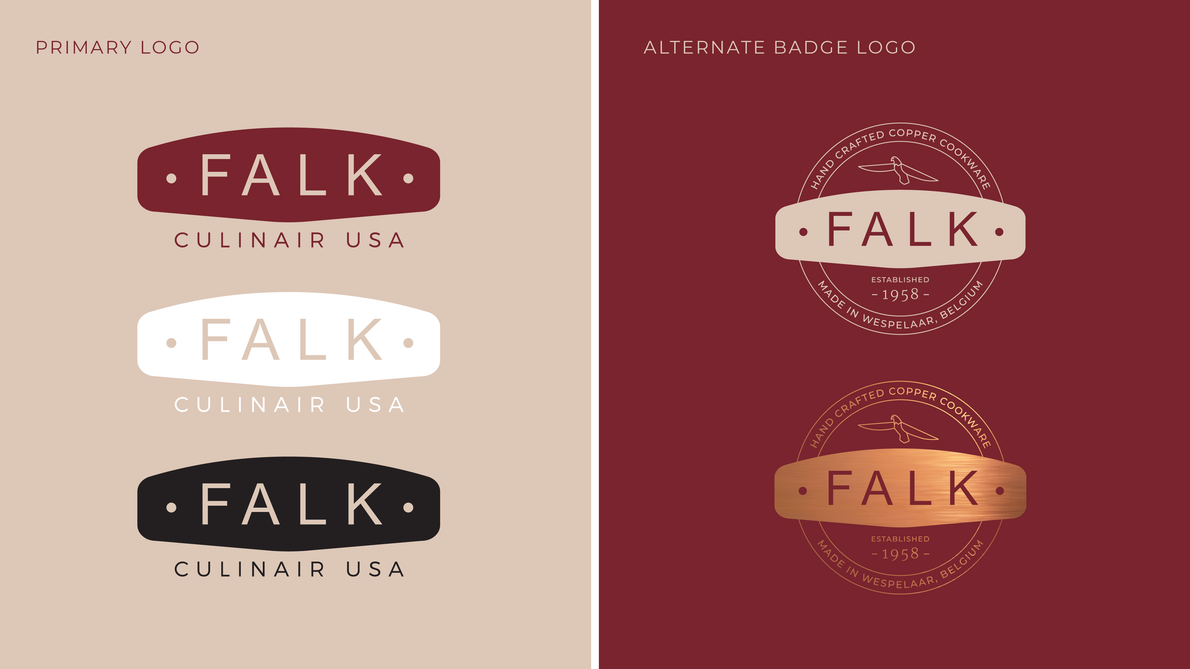
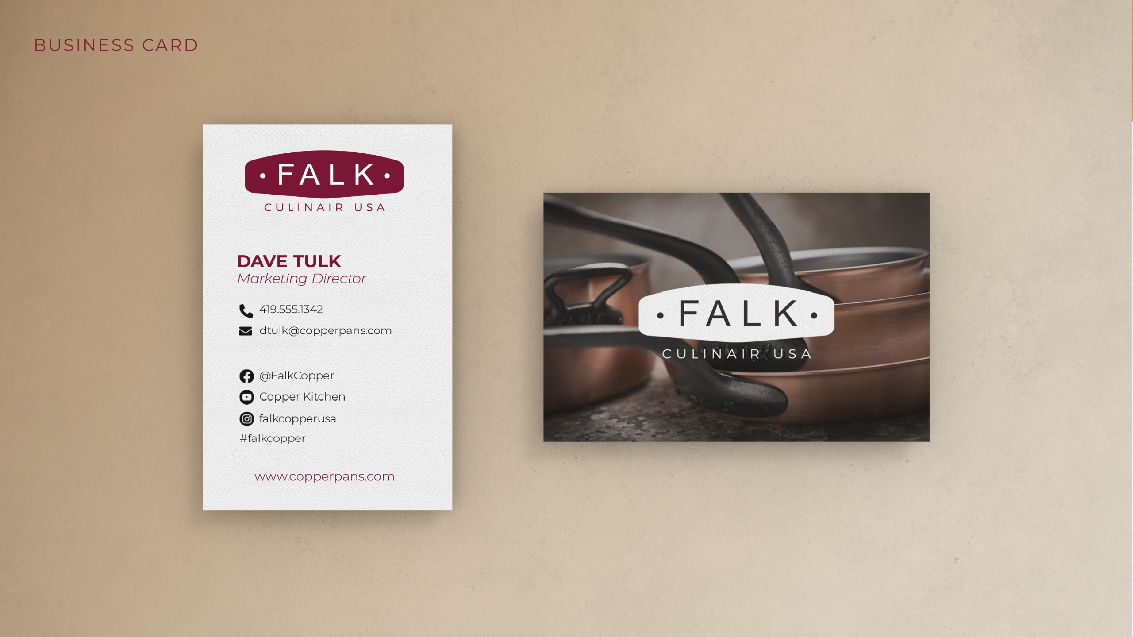
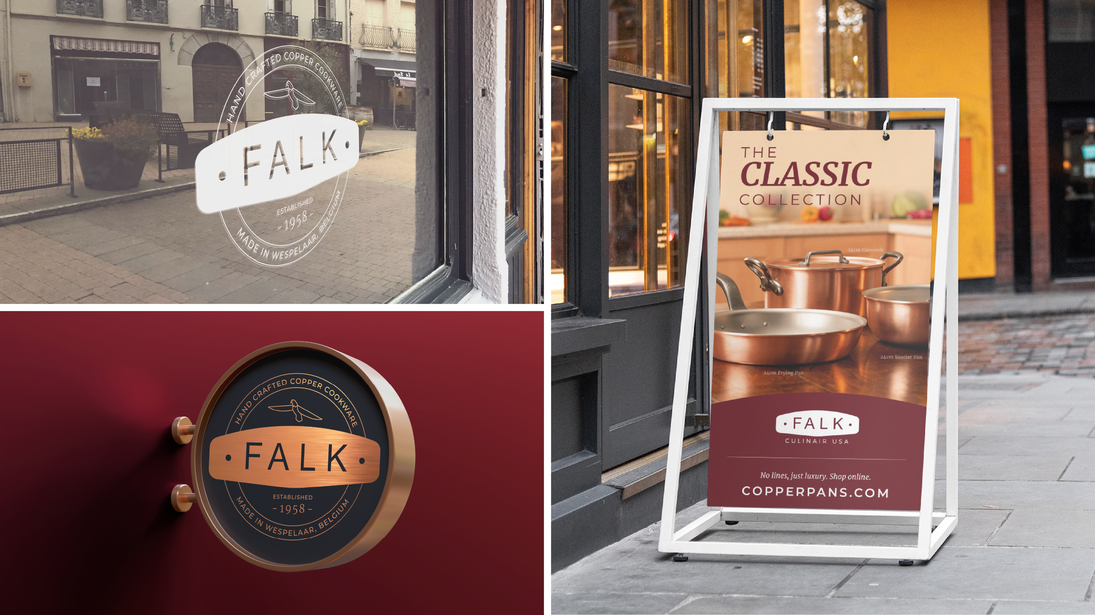
Logo suite
The primary mark echoes a pan handle to connect directly to Falk’s craft. An alternate vintage inspired badge adds heritage while keeping the system flexible and recognizable.
The primary mark echoes a pan handle to connect directly to Falk’s craft. An alternate vintage inspired badge adds heritage while keeping the system flexible and recognizable.
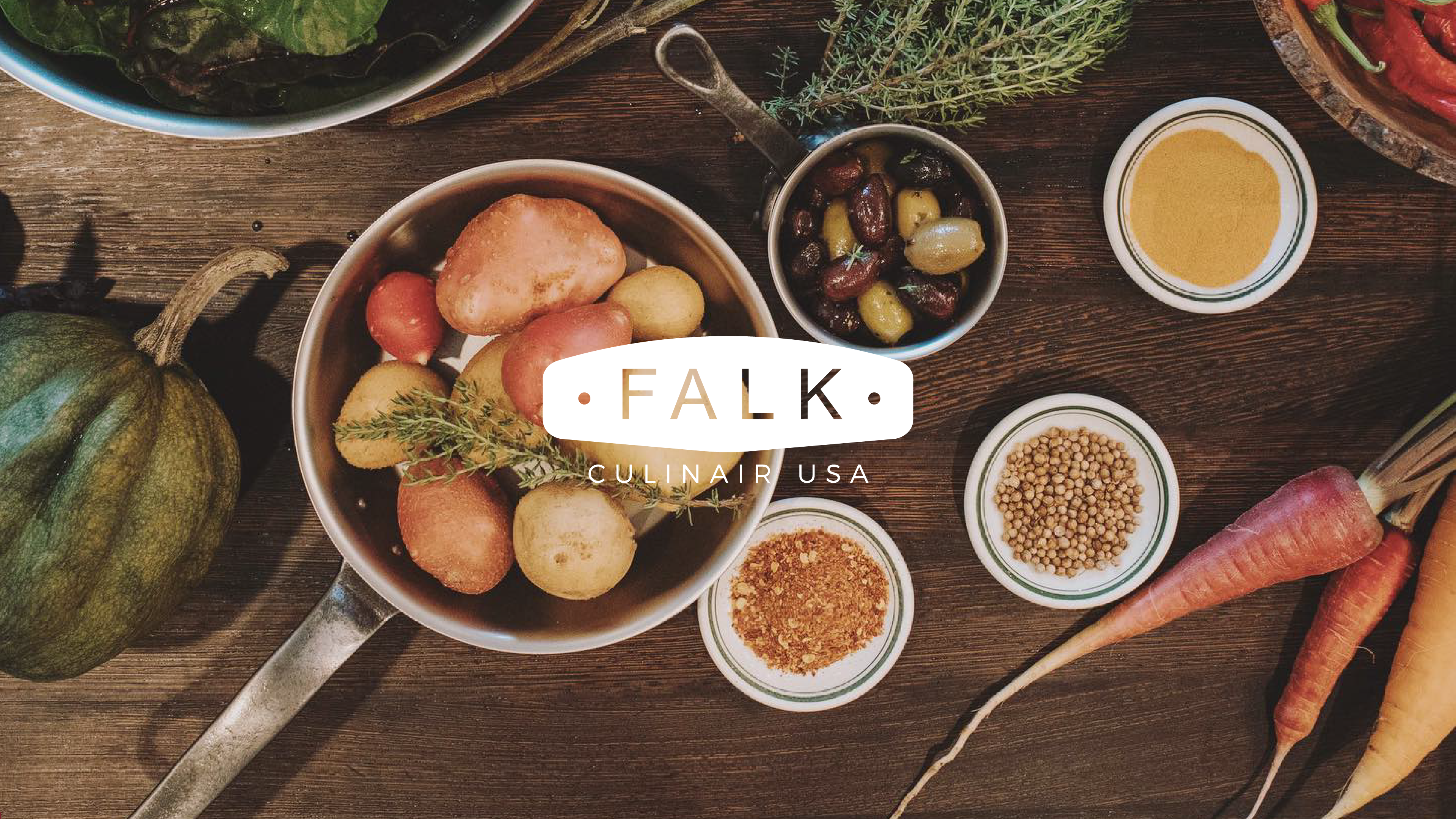
Imagery
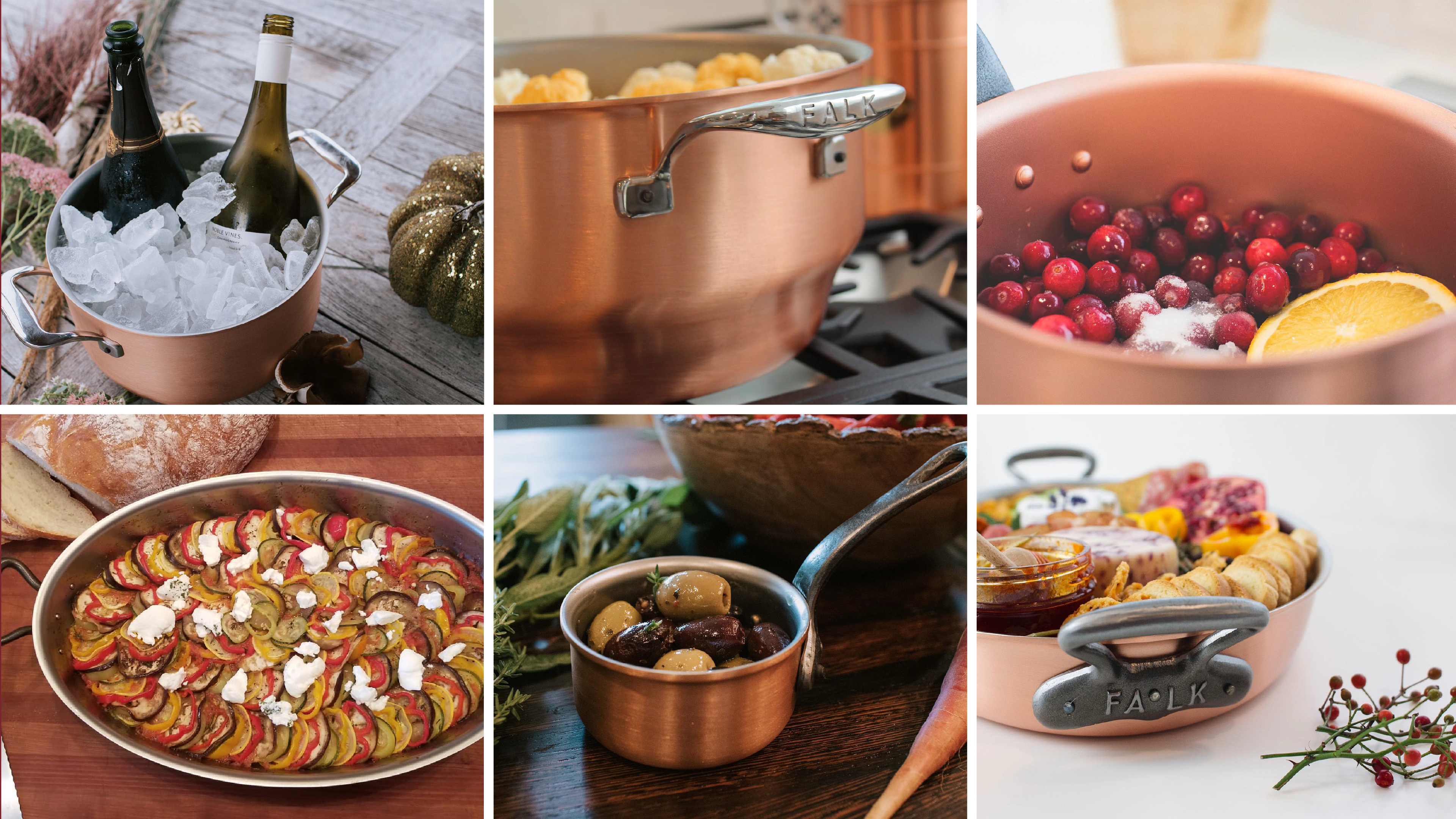
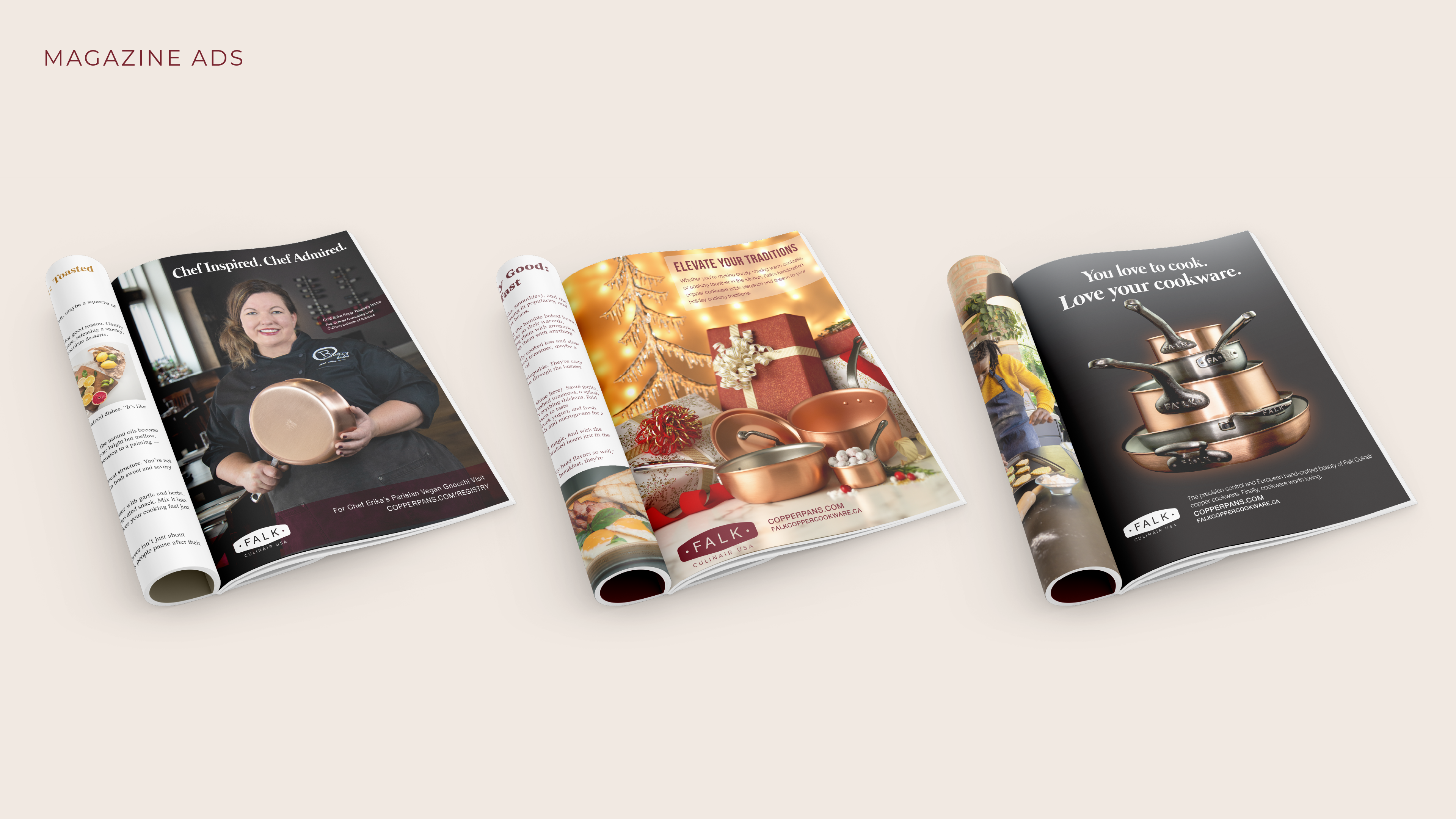
Close detail and simple lifestyle scenes celebrate the copper finish and hand made quality. Lighting stays soft and natural so the product remains the hero.
Close detail and simple lifestyle scenes celebrate the copper finish and hand made quality. Lighting stays soft and natural so the product remains the hero.

Process
Challenge
Elevate a heritage cookware brand with a modern, cohesive system.
Approach
Anchor the identity in product craft, build a flexible mark family, set a warm refined palette, and prove it across literature, signage, imagery, and accessories.
Result
A timeless, premium look that reads elegant and functional in every setting.
Credits
Solo project with peer critique.
Solo project with peer critique.

Like this project?